
Business Intelligence SaaS vs Cognitive Intelligence
BI tools are the most widely deployed analytics infrastructure in marketing — and the most widely misunderstood in terms of what they actually provide. Tableau, Power BI, Looker Studio, Qlik, Sisense and Metabase solve a real problem: making historical data accessible, visual and shareable.
They are not intelligence systems. They are information delivery systems. An information system tells you churn rose 3.2% last quarter. An intelligence system tells you which customers will churn in the next 21 days, which intervention will work for each, and executes it before the cancellation happens.
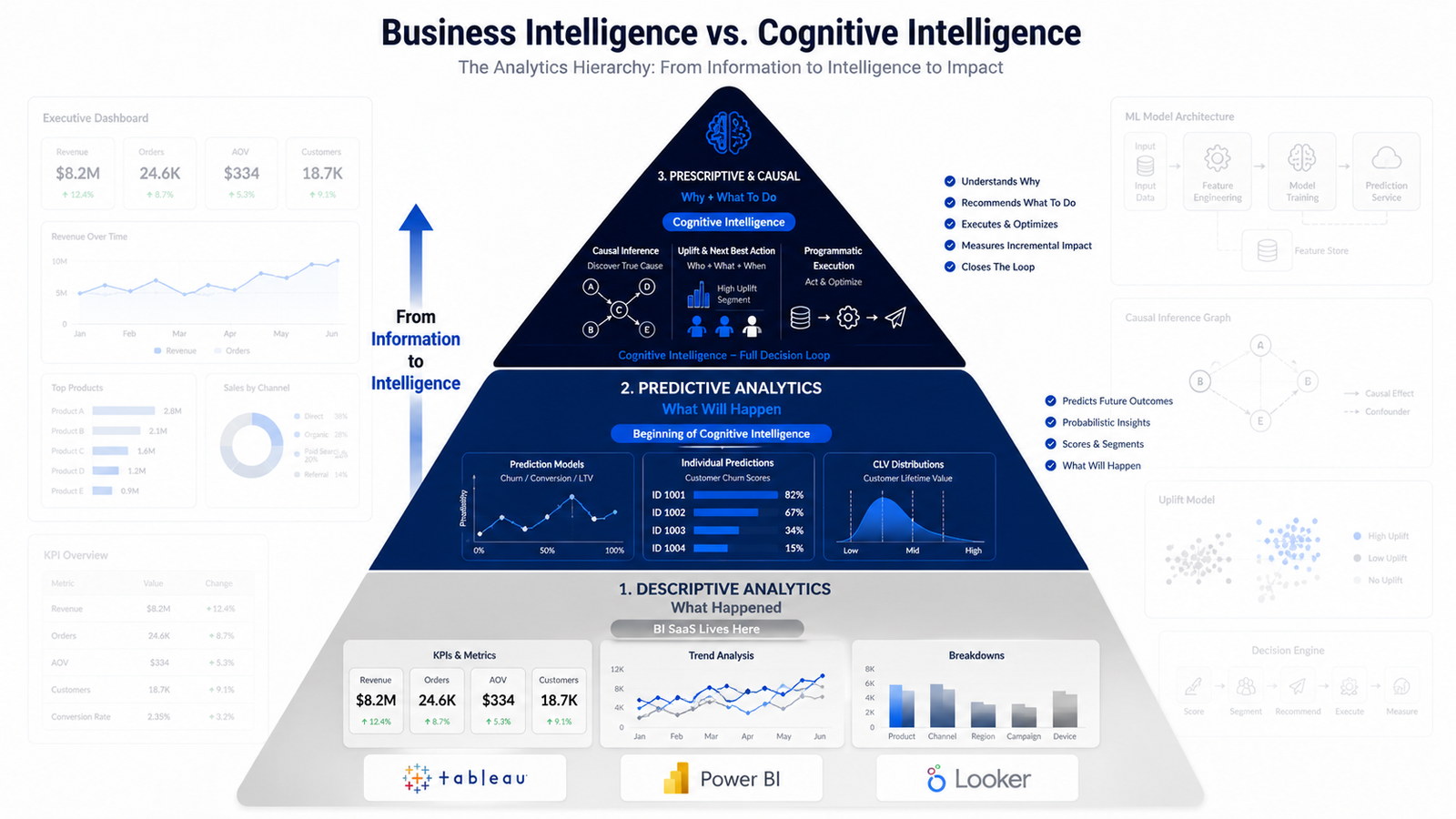
The three levels of analytics, and where BI lives
Understanding where BI fits requires seeing the whole capability spectrum. Every BI SaaS tool operates at Level 1.
- Level 1 — Descriptive analytics“What happened?”Historical visualisation, KPI dashboards, trend lines, cohort comparisons, revenue by channel, ROAS by campaign. Genuinely valuable — it provides the operational visibility that makes monitoring and reactive decisions possible. Its limitation is definitional: the cost of a problem is already incurred before a descriptive dashboard surfaces it.
- Level 2 — Predictive analytics“What will happen?”Some BI tools claim this. What they usually provide is trend extrapolation — linear projections, moving averages, basic regression on historical time series. That produces reasonable accuracy when the future resembles the past, and fails systematically when market conditions change. True predictive analytics requires ML trained on behavioural data, which BI platforms do not provide.
- Level 3 — Prescriptive and causal analytics“Why did it happen, and what should we do?”Causal inference identifying which variables genuinely caused the outcome. Uplift modelling identifying who will respond to intervention. Incrementality testing validating genuine additional revenue. Programmatic execution turning analysis into deployed strategy. No BI SaaS tool operates here.
What are business intelligence tools?
Data visualisation and reporting platforms that connect to sources — databases, warehouses, SaaS applications, spreadsheets — and let users build dashboards without SQL or data engineering expertise. Their value is operational visibility: making sure stakeholders can see the metrics that inform day-to-day decisions.
What they are: visualisation and reporting tools that make historical data accessible and shareable. What they are not: predictive modelling platforms, causal inference systems, ML development environments, or optimisation engines for the decisions that actually determine marketing profitability.
Five tiers of BI and reporting software
Most BI comparisons cover only tier 1. Marketing teams overwhelmingly live in tier 4 — and that tier is missing from almost every analysis of this category.
Enterprise BI platforms
- Tableau
- Power BI
- Qlik Sense
- Sisense
- ThoughtSpot
- Domo
- MicroStrategy
- SAP Analytics Cloud
Deep visualisation, governance and organisational data sharing. Priced per seat, and every one of them lives at Level 1.
Google-native and free
- Looker Studio (free)
- Looker Enterprise
- Google Sheets + connectors
Native GA4, Google Ads, Search Console and BigQuery connectivity at zero cost. The default reporting layer for most marketing teams and agencies.
Open source
- Metabase (open source)
- Apache Superset (open source)
- Redash (open source)
- Grafana (open source)
Genuine BI capability at zero licence cost, in exchange for hosting and maintenance. Strong choice for technical teams with a standard database backend.
Marketing reporting specialists
- AgencyAnalytics
- Whatagraph
- Databox
- Klipfolio
- DashThis
- Improvado
- Funnel.io
- Supermetrics
- Adverity
This is where most marketing teams and agencies actually work. Pre-built connectors to every ad platform, client-ready templates, automated delivery. Supermetrics, Funnel.io, Improvado and Adverity are pipelines rather than dashboards — they move data into whatever BI layer sits on top. The analytical ceiling is identical in all of them.
Product and behavioural analytics
- Mixpanel
- Amplitude
- Heap
- PostHog (open source)
- FullStory
- Pendo
Event-level behavioural analysis rather than aggregate reporting. Genuinely closer to individual-level intelligence than tiers 1 to 4 — funnels, cohorts and retention curves at user level. Still descriptive: they show which sequence occurred, not which sequence will occur or why.
Honest analysis of the leading platforms
Each assessment covers genuine strengths and where the architecture stops. The ceiling is not a quality problem — it is what these products are designed to be.
Tableau
What it doesThe most widely adopted enterprise visualisation platform, with drag-and-drop dashboards, extensive customisation and Einstein-powered natural language features.
Who uses itEnterprise analytics teams, marketing operations, finance and executive stakeholders.
Genuine strengthsVisualisation depth and flexibility among the most extensive available. Connects to virtually any enterprise source. Strong governance for large deployments. Enormous community and learning resources.
Where the ceiling isExplain Data, Ask Data and Einstein insights generate natural-language observations about dashboard data using an LLM. A dashboard showing ROAS dropped 15% delivers the same information as a chart, more accessibly. It does not explain why, which component drove it, or what the optimal response is.
Power BI
What it doesMicrosoft's BI platform with dashboards, data modelling through Power Query and DAX, and Copilot for AI-assisted report generation.
Who uses itOrganisations inside the Microsoft ecosystem — Azure, Office 365, Dynamics 365.
Genuine strengthsNative Microsoft connectivity genuinely reduces engineering friction. Materially better value than Tableau at the entry tier. Copilot lowers the barrier for non-technical users. Strong modelling for analytically capable users.
Where the ceiling isCopilot summarises existing data; it does not add predictive ML, causal inference or prescriptive capability. AI insights apply basic statistical tests to surface anomalies — useful, and fundamentally different from prediction. Going further requires bolting on external ML infrastructure.
Looker Studio
What it doesGoogle's free visualisation and reporting platform, with native connectivity to GA4, Google Ads, Search Console, BigQuery and YouTube Analytics.
Who uses itMarketing teams inside the Google ecosystem, and agencies building client reporting.
Genuine strengthsFree, which makes it accessible at any budget. Native Google connectivity without connector configuration. Entirely sufficient for standard campaign and channel reporting.
Where the ceiling isIts analytical capability reflects its price. It visualises connected sources without transformation or modelling depth. To move from visualising BigQuery data to modelling behaviour inside it, BigQuery ML or custom Python is required — Looker Studio is the wrong layer.
Qlik Sense
What it doesBI built on an associative data engine that lets users explore relationships without predefined hierarchies, plus Insight Advisor for automated analysis.
Who uses itOrganisations with complex multi-source data where the questions change frequently.
Genuine strengthsThe associative engine is genuinely differentiating where dimensional models create blind spots. Strong self-service exploration for analytically capable users. Enterprise governance and cataloguing.
Where the ceiling isThe associative engine explores historical relationships flexibly. It does not enable predictive modelling or causal inference. Qlik's AutoML is a starting point for prediction rather than a complete solution, and marketing-grade causal work still requires separate ML infrastructure.
Sisense
What it doesBI focused on embedded analytics — APIs and SDKs for putting dashboards inside your own product, plus standard internal BI.
Who uses itSaaS companies embedding analytics for their customers, and internal analytics teams.
Genuine strengthsEmbedded analytics capability is genuine and differentiating for product teams. API-first architecture integrates cleanly. Solid internal BI for standard reporting.
Where the ceiling isEmbedding is a delivery mechanism, not an analytical upgrade. An embedded dashboard delivers the same descriptive analytics in a different interface. For marketing intelligence, the relevant gap is predictive and causal — which embedding does not address.
Metabase
What it doesOpen-source BI with dashboard creation, a no-SQL question interface and a full SQL editor for technical users.
Who uses itStartups and technical teams needing accessible BI without enterprise pricing.
Genuine strengthsGenuine BI capability at zero licence cost self-hosted. The question interface enables exploration without SQL. Simple setup on standard relational backends.
Where the ceiling isAnalytical depth reflects its positioning. No predictive modelling or causal inference beyond what is pre-computed in the database and visualised. A foundation for data democratisation — not a destination for analytics maturity.
Also assessed: ThoughtSpot, Domo, MicroStrategy, SAP Analytics Cloud, Apache Superset, Redash, Grafana, AgencyAnalytics, Whatagraph, Databox, Klipfolio, DashThis, Improvado, Funnel.io, Supermetrics, Adverity, Mixpanel, Amplitude, Heap, PostHog and Pendo. The differences between them are operational — connectors, pricing, governance, delivery. The analytical ceiling is identical across all of them.
Level 1 analytics described in Level 3 language
Placeholder — no video yet. Delete this box and drop in the Elementor Video widget when the recording is ready, or hide this whole section from Advanced → Responsive until then.
The “AI features” every BI platform has added
Tableau AI, Power BI Copilot, Looker AI, Qlik Insight Advisor. All positioned as transformative intelligence. They deserve an accurate description.
What they actually do: use a large language model to generate natural-language summaries of existing dashboard data, enable conversational querying, and produce automated observations about patterns.
Ask Copilot “why did our ROAS drop last week?” and you get a description of what the dashboard shows — which channels declined, which campaigns, which periods.
This is an LLM reading your dashboard and writing sentences about it.
Causal analysis identifies which variable produced the outcome, tested against counterfactuals — not summarised from a chart.
Predictive modelling forecasts what has not happened yet, from behavioural sequences the dashboard never contained.
Prescriptive analytics selects the intervention with the highest causal lift, and executes it.
AI-assisted BI makes descriptive analytics more accessible. It does not change what descriptive analytics is. It is Level 1 analytics described in Level 3 language.
Backward-looking by architecture
Every BI tool is designed to connect to sources, retrieve historical data and display it. The “predictive” features are trend extrapolations assuming the future resembles the past.
Churn rose 3.2% this quarter. The dashboard surfaces it after the quarter ended — after the customers left, after the revenue was lost, after the window for intervention closed.
Every insight arrives with the cost already incurred.
Operates forward — predicting which specific customers will churn in the next 21 days, with enough lead time to intervene before the event.
The insight arrives while the outcome is still changeable.
Aggregate metrics without individual intelligence
Dashboards display averages. Averages mask exactly the individual variation that creates optimisation opportunity.
An average churn rate of 3.2% tells you nothing about which customers are leaving. An average LTV of $185 tells you nothing about who deserves retention investment.
An average ROAS of 4.2 tells you nothing about which segments generate the return and which dilute it.
Operates at individual level — a probability score for each customer, each lead, each segment.
Intervention targets individuals based on predicted behaviour, not cohorts based on historical averages.
Observation without explanation
Dashboards observe outcomes without explaining the mechanism that produced them.
ROAS drops from 4.2 to 2.8. The dashboard shows the drop.
It cannot tell you whether the cause was creative fatigue, audience saturation, competitor spend, a platform algorithm change or a pricing change. Without that, the response is guesswork — trying adjustments until something reverses the line.
Provides causal explanation — identifying which variables genuinely produced the outcome through empirical diagnostics and causal inference frameworks.
The corrective action addresses the mechanism rather than the symptom.
The report is the final output
Every BI tool ends at a report. The report goes to a meeting. The meeting produces a decision. A human then implements it.
The gap between insight and action — visible on the dashboard on Monday, acted on at the next planning cycle — is where optimisation opportunity is systematically lost.
The analysis was correct. The latency destroyed its value.
Translates model output into programmatic API execution.
Optimisation happens at the speed of data rather than the speed of organisational decision-making cycles.
No causal validation of marketing spend
Dashboards report ROAS, CPA and revenue by channel. They cannot validate whether that performance reflects genuine incremental contribution.
Google Ads ROAS 5.2, Meta ROAS 3.8. Neither number is evidence that either channel generated demand rather than captured it.
Budget allocated on these figures may be funding channels that predominantly intercept customers who would have converted organically.
Validates contribution causally using synthetic controls, CausalML and matched market testing.
The output is defensible evidence of true incremental ROI — the kind a CFO can act on.
BI SaaS vs Cognitive Intelligence
Not a comparison of dashboard sophistication. A comparison of analytical framework.
| Dimension | Business intelligence SaaS | Cognitive Intelligence |
|---|---|---|
| Analytics level | ×Level 1 — descriptive only | ✓Levels 2 and 3 — predictive and causal |
| Time orientation | ×Backward-looking by design | ✓Forward-looking by design |
| Granularity | ×Aggregate metrics and averages | ✓Individual-level probability scores |
| Explanation | ×Observation without cause | ✓Causal diagnosis of the mechanism |
| “AI” capability | ×LLM summaries of dashboard data | ✓Trained ML and causal models |
| Prediction method | ×Trend extrapolation | ✓Custom ML architectures |
| Incrementality | ×Not measured | ✓Synthetic controls and true lift |
| Alerting | ×Generic metric thresholds | ✓Individual churn and risk prediction |
| Customer value | ×Cohort averages | ✓BG/NBD individual CLV |
| Market change | ×Assumes the past repeats | ✓Condition-aware modelling |
| Final output | ×A report | ✓An executed strategy |
| Speed of action | ×Human decision cycles | ✓Programmatic API execution |
| Commercial model | ×$0–$100k+ subscription | ✓Custom engagement investment |
When BI is the right choice, and when it is not
BI tools belong in every organisation’s stack. The question is whether they should also be expected to do the predicting.
BI SaaS is the right choice when
- Operational visibility is the requirement — stakeholders need to see the metrics that inform daily monitoring
- Stakeholder reporting is the use case — executive dashboards, board decks, investor metrics
- Data democratisation is the goal — giving non-technical teams access without SQL
- Historical trend analysis is genuinely sufficient for the decision at hand
- The organisation is early in analytics maturity, where basic visibility is the correct first step
Cognitive Intelligence becomes necessary when
- You need to predict outcomes before they occur — churn before cancellation, demand before stock-out
- You need causal explanation, not just the observation that a number moved
- You need individual-level intelligence — which customers, which leads, which segments
- You need to validate marketing ROI causally for a CFO or board
- Optimisation needs to happen at data speed rather than meeting speed
- Your dashboard is producing reports that are read, discussed, then acted on weeks later
Where AI agents fit alongside your dashboards
Agents do not replace the BI layer — they populate it. Model outputs written back into Tableau, Power BI or Looker Studio turn a descriptive dashboard into one displaying individual predictions.
Workflow agents on n8n, Make.com or Zapier handle refresh, alerting and distribution. Autonomous agents produce the predictions and causal diagnoses the dashboard cannot. MCP gives either governed access to the warehouse; skills keep every run to the same standard.
| Task | Architecture that fits | Why |
|---|---|---|
| Predicting who churns next | Autonomous — sequence models score every customer on fresh data | A dashboard threshold reports the rate after the fact |
| Diagnosing why a metric moved | Autonomous — causal inference tests candidate mechanisms | An LLM summary describes the movement without explaining it |
| Deciding budget reallocation | Autonomous — incrementality models rank true contribution | A rule follows reported ROAS, which is the problem |
| Alerting when a metric breaches | Workflow — threshold crossed, notification sent, task created | Ideal for a rule; BI already does this well |
| Refreshing and distributing reports | Workflow with MCP — scheduled pulls and delivery | Ideal for a rule; no modelling involved |
| Writing model output into the dashboard | Workflow with MCP — scores pushed into the BI layer | Ideal for a rule; the score comes from the model |
What stays with a person
- Deciding which metric matters. A dashboard full of accurate numbers measuring the wrong thing is worse than no dashboard.
- Accepting a causal conclusion. Causal inference produces evidence, not verdicts; the judgement about what it means stays human.
- Reallocation above the agreed threshold. A model can recommend it. A person signs it off.
- What gets reported to a board. Generated narrative around financial numbers is a governance risk, not an efficiency gain.
The full breakdown sits in the AI agents section.
The honest summary
BI tools are valuable and should exist in every analytics stack. They provide the operational visibility and stakeholder reporting that data-informed organisations require.
They are not intelligence. They are information delivery.
A dashboard showing that churn increased 3.2% last quarter.
Accurate. Well presented. Delivered to everyone who needs it.
And entirely about a quarter that has already ended.
Identifying that 847 specific customers have a greater than 73% probability of churning within 21 days, that 312 of them sit in the persuadable segment where intervention has causal lift above 40%, and executing personalised retention for those 312 through programmatic API connections — before a single cancellation occurs.
Questions about business intelligence tools
Do I need to replace Tableau or Power BI?
No. In almost every engagement the BI layer stays exactly where it is — it remains the right tool for stakeholder reporting and operational visibility. What changes is what feeds it: model outputs, individual risk scores and causal findings written back into the dashboards your team already uses.
Are the AI features in Power BI and Tableau not doing this already?
They are doing something genuinely useful, but it is a different thing. Copilot and Explain Data use a language model to summarise what the dashboard already shows, in sentences instead of charts. That lowers the barrier to reading data. It does not add prediction, causal inference or prescription — the underlying analysis is unchanged.
What is the practical difference between predictive and causal analytics?
Prediction tells you what will happen if nothing changes — this customer will probably churn. Causal analysis tells you what happens because you act — this customer will stay if contacted, that one will churn regardless, and this third one disengages faster when contacted. Budget allocated on prediction alone funds all three groups equally.
We use Supermetrics and Looker Studio, not Tableau. Does this still apply?
Entirely. Supermetrics, Funnel.io, Improvado and Adverity are data pipelines; Looker Studio, AgencyAnalytics and Databox are the presentation layer on top. Together they solve the plumbing and reporting problem very well. The analytical ceiling is identical to Tableau’s — both stacks operate at Level 1.
Can AI agents run analytics without a BI tool at all?
They can, but it is rarely the right design. People need a place to look, and dashboards are good at that. The productive pattern is agents producing predictions and causal findings, then writing them into the BI layer through MCP — so the team keeps its familiar interface while the numbers inside it become forward-looking.
Is this relevant for a smaller business using free Looker Studio?
The gap is the same, but the economics differ. If free reporting is meeting your needs and marketing spend is modest, custom modelling is unlikely to earn its cost yet — and that gets said directly. The threshold is usually spend level and data volume rather than which dashboard tool sits on top.

Usman Saeed
AI-Driven Digital Marketing Intelligence Consultant & Growth Engineer in Pakistan. Usman Saeed specializes in engineering resilient digital growth architectures — helping enterprise brands eliminate tracking data drops, secure conversion signals, and maximize profitability through E-commerce Engineering, server-side Signal Engineering, and Predictive Intelligence. With 12+ years of experience and advanced data science expertise, marketing guesswork is replaced with mathematical precision — automated systems that bridge execution with business intelligence, ensuring your investment delivers measurable scale.
Where to go next
The intelligence starts where the dashboard ends
The audit examines what your current reporting can and cannot answer. If descriptive analytics genuinely covers your decisions, you will be told that directly.