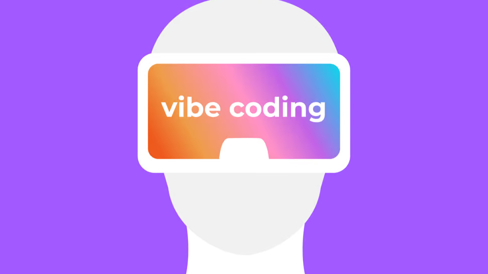
7 AI Website Design Mistakes That Kill Your UX, SEO, and Conversions — And How to Fix Them
The rise of AI-powered website builders and vibe coding tools has made it possible for anyone to launch a professional-looking website in hours without any prior web design experience. That accessibility is genuinely valuable — but it has also introduced a wave of AI website design mistakes that are remarkably consistent, remarkably avoidable, and remarkably damaging to user experience, SEO performance, and conversion rates.
Y Combinator general partner Aaron Epstein and Raphael Schaad — founder of Cron, which was acquired by Notion — spent time reviewing AI-generated websites and catalogued the seven most common categories of vibe coded website errors. Their findings reveal a pattern that affects startups, small businesses, and individual entrepreneurs alike: when AI tools are given too much creative control without experienced human oversight), the result is a website that looks busy but communicates nothing), looks modern but feels identical to every other AI-built site, and looks designed but actively confuses the user.
This guide breaks down all seven AI website mistakes) in detail, explains why each one is damaging to your digital marketing performance and SEO visibility, and gives you the practical fixes to ensure your AI-assisted website actually serves your business goals rather than undermining them.
Table of Contents
- Generic Design Trends That Make Your Site Look Like Everyone Else’s
- Unexpected User Interaction Feedback That Confuses and Distracts
- Broken and Confusing UX Patterns That Create Friction
- Weak Messaging That Fails to Explain Your Product or Service
- Poor Information Hierarchy That Overloads and Loses the Reader
- Inconsistent Branding and Visual Systems That Undermine Trust
- Over-Reliance on AI Without Experienced Human Judgment
- Why These Mistakes Matter for SEO and Digital Marketing
- FAQs: AI Website Design Mistakes
- Conclusion
MISTAKE #1: GENERIC DESIGN TRENDS THAT MAKE YOUR SITE LOOK LIKE EVERYONE ELSE’S
The single most pervasive AI website design mistake is allowing the AI tool to make all creative decisions without any brand direction or design system input. When a user prompts an LLM-based design tool with vague instructions like “make it modern” or “give it a professional feel”, the output is entirely predictable: the most statistically common design choices from the AI’s training data. That means purple gradients, bento-box grid layouts, Google-color dashboard mockups, and hover animations that have been rendered so many times across the web that they have become visual wallpaper — invisible and interchangeable.
The problem is not that these AI design patterns are objectively bad in isolation. Many of them were genuinely innovative when they first appeared. The problem is that AI tools are trained on the most widely linked, most commonly referenced examples of good web design). When one startup landing page establishes a compelling purple gradient aesthetic, that example enters AI training data and within weeks, dozens of AI-built websites carry the same visual signature — draining the original trend of any distinctiveness it ever had.
The five most commonly recurring generic AI design patterns to avoid are:
- Overusing purple gradients across hero sections, CTAs, and backgrounds without any intentional brand reasoning behind the color choice.
- Repeating generic AI dashboard mockups featuring the classic red, yellow, green, blue color callout blocks that have become hallmarks of AI-generated UI design.
- Bento-box grid layouts applied without modification or originality — recognizable as a template choice rather than a deliberate brand decision.
- Emoji-style icons and generic SVG decorations that look like they came from a free icon library because they did — or because the AI defaulted to its most common visual vocabulary.
- Section fade-in animations and scroll-triggered effects that were once a sign of modern web development and are now a sign of AI-generated design because they appear on virtually every vibe-coded website.
Fix It: Before you prompt your AI design tool, define your brand direction in writing. Specify your color palette, typography style, visual tone, and at least two or three reference sites that match the aesthetic you’re going for — but explicitly instruct the AI NOT to copy their specific design elements. Give the AI a creative brief, not a blank canvas.
Every element on your website communicates something about your brand). A generic AI design communicates that no human made any deliberate choices here). For businesses investing in digital marketing strategies, that signal is antithetical to brand building — and it has direct consequences for user trust, conversion rates, and SEO brand signals.
MISTAKE #2: UNEXPECTED USER INTERACTION FEEDBACK THAT CONFUSES AND DISTRACTS
Good web design is built on a shared language between the website and the user. User interaction feedback — the way buttons visually respond to hover, the way clicked links change state, the way form fields highlight when active — is part of that shared language. It tells users what is clickable, what happened when they clicked, and what the page is doing. When that feedback language is violated — when elements behave in ways the user does not expect — the result is confusion, frustration, and ultimately abandonment.
AI-generated websites frequently introduce unexpected interaction feedback because the AI design tools optimize for visual impressiveness rather than usability. The result is a design that is technically sophisticated but functionally disorienting — the digital equivalent of a glass wall in the middle of a lobby. Users expect the environment to behave a certain way; when it does not, they become disoriented rather than engaged.
The seven most damaging unexpected interaction patterns to eliminate from your AI-built website are:
- Lines following the user’s cursor down the page — visually distracting and purposeless; they steal attention from your core message.
- Cursor-following light or glow effects — technically impressive, practically meaningless, and harmful to conversion focus.
- Superfluous background animations — any animation that exists for visual texture rather than functional communication is consuming cognitive bandwidth the user needs to process your value proposition.
- Automatic fade-in effects on content elements — accessibility-unfriendly, visually jarring for returning users, and often interfering with above-the-fold content visibility.
- Moving or repositioning buttons — any interactive element that shifts position on hover or click violates the fundamental UX principle that interactive targets must be stable.
- Hover effects that move elements without clear purpose — there is a meaningful difference between a hover effect that provides interaction feedback and one that simply moves things around for aesthetic effect.
- Animations that draw more attention than the product itself — when the animation is what users remember, not your product) or service, your conversion funnel is broken.
Every animation on your website should answer one question: what does this communicate to the user that a static element could not? If there is no clear answer, the animation does not belong. UI animations should provide feedback, indicate state changes, or guide attention — not entertain.
MISTAKE #3: BROKEN AND CONFUSING UX PATTERNS THAT CREATE FRICTION
Of all seven AI website mistakes, broken UX patterns are the most directly damaging to website performance). Where generic design makes a site forgettable, and unexpected animations make it annoying, broken UX patterns make it unusable). Users who cannot navigate your website predictably will not stay on it long enough to convert — and high bounce rates from poor UX directly signal low page quality to search engines like Google, harming your SEO performance.
The most frequently cited UX failure in AI-generated websites is scroll jacking — the practice of using JavaScript to override the browser’s native scrolling behavior and replace it with a custom, animation-driven scroll experience. Scroll jacking is almost universally experienced as frustrating by users because it violates a fundamental expectation: that scrolling down the page will simply move the page down. When an AI design tool introduces scroll jacking to create a cinematic scrolling experience), it is prioritizing aesthetic effect over the user’s ability to navigate — a trade-off that virtually always harms conversion rates.
The full spectrum of broken UX patterns to audit and remove from your AI-built website includes:
- Scroll jacking in any form — override of native browser scroll behavior is almost never justified for commercial websites.
- Non-standard navigation patterns — any navigation that departs significantly from what users expect (horizontal nav, hidden menus, gesture-driven nav) needs an extremely strong justification.
- Menus that jump, animate inconsistently, or lag — navigation must be the most reliably stable element on your website.
- Clickable-looking elements that are not interactive — every element that looks like a button or link must behave as one; every element that is not interactive must not look like one.
- Hover-only functionality — any content or feature that is only accessible via hover is inaccessible on mobile devices and invisible to touch-screen users.
- Duplicate or conflicting sticky header behavior — competing fixed elements are a common AI design output that creates visual chaos and reduces usable screen space.
- Animations that block content access — any loading animation or transition effect that prevents users from scrolling past it is a critical UX failure.
Fix It: Test every interactive element on your website on a mobile device before publishing. If a navigation element, scroll behavior, or animation makes your site harder to use on a phone, it needs to go. Mobile users account for more than 60% of global web traffic — and Google’s mobile-first indexing means your mobile UX directly affects your search rankings.
MISTAKE #4: WEAK MESSAGING THAT FAILS TO EXPLAIN YOUR PRODUCT OR SERVICE
A website that looks professionally designed but fails to clearly communicate what the product or service is, who it is for, and why the visitor should care is not a designed website — it is a design-shaped obstacle between your business and your customers). This is one of the most consequential AI website mistakes because it is the one that most directly destroys conversion rates), and it is one that AI content generation tools are particularly prone to producing.
AI-generated website copy defaults to ambiguous, high-sounding language that uses impressive-sounding words without communicating anything specific. Phrases like “powering the future of enterprise connectivity” or “intelligent solutions for the modern workflow” are the textual equivalent of a generic purple gradient: technically plausible, completely unmemorable, and utterly unhelpful to a visitor trying to decide whether your product or service solves their problem.
Every landing page must answer six questions for every visitor, and must answer them above the fold or within the first scroll:
- What is this? — A precise, jargon-free description of your product or service in plain language.
- What does it do? — The specific function or benefit the product delivers, described in concrete terms.
- Who is it for? — The specific type of person or business that would benefit from this product or service.
- Why should I care? — The specific problem it solves or the specific outcome it produces, stated clearly.
- How is it different? — What makes this product or service meaningfully distinct from the alternatives that already exist.
- What should I do next? — A clear, specific call to action that tells the visitor exactly what step to take to move forward.
If your AI-generated website copy cannot answer all six of those questions clearly on the first page, it needs to be rewritten by a human who understands both the product and the target audience). No amount of visual design quality compensates for a value proposition that fails to communicate. For businesses running digital marketing campaigns that drive paid traffic to their website, this is a conversion optimization emergency — every click you pay for that lands on a page with weak messaging is wasted budget.
Pro Tip: Apply the 5-second test to your homepage. Show it to someone unfamiliar with your business for exactly 5 seconds, then ask them to describe what your company does. If they cannot answer correctly, your above-the-fold messaging has failed — regardless of how beautiful the design is.
MISTAKE #5: POOR INFORMATION HIERARCHY THAT OVERLOADS AND LOSES THE READER
Information hierarchy is the visual and structural system that tells a reader what to read first, what supports that, and what is detail). A well-designed information hierarchy guides the visitor through your page in the order that most effectively communicates your value proposition and moves them toward conversion). Poor information hierarchy — which is an extremely common output of AI design tools — does the opposite: it presents every element with equal visual weight, creating a cluttered, disorienting page where nothing stands out because everything is competing for attention.
AI-generated web pages frequently suffer from information hierarchy failures because AI tools optimize for visual completeness — adding decorative labels), section dividers), icon annotations), and text styles to make the page look fully designed. But design elements that add visual complexity without adding clarity or meaning are not doing any work — they are consuming the reader’s cognitive bandwidth that should be reserved for understanding your product or service.
The most common information hierarchy mistakes in AI-built websites are:
- Too many competing text styles — when every paragraph has a different font weight), size), or color), none of them stand out as more important than the others.
- Decorative labels and badges that do not add semantic meaning — “NEW” badges, “FEATURED” labels, and “POPULAR” tags are meaningful when they reflect real information; they are visual noise when applied generically.
- Weak headline-to-subhead-to-body-text hierarchy — the visual size gap between your H1 headline), H2 subheadings), and body copy should be immediately obvious; AI tools often compress this gap in ways that make pages harder to scan.
- Visually overbuilt sections that look impressive but fail to communicate) — elaborate card layouts), animated statistics), and complex data visualizations that require careful study to understand are conversion killers) for most commercial websites.
- Vertical space filled with decorative elements rather than meaningful content — padding sections with abstract illustrations), geometric shapes), and texture elements is a signature AI design output that adds scroll depth without adding value.
Every text element and visual element on your page should be doing a specific job. Ask yourself: is this element helping the reader understand what we do, why they should care, or what to do next? If the answer is no — if it is there purely for aesthetic reasons — remove it. Clean, purposeful design converts better than busy, impressive design.
MISTAKE #6: INCONSISTENT BRANDING AND VISUAL SYSTEMS THAT UNDERMINE TRUST
A coherent brand visual system is one of the most powerful trust signals a website can communicate. When every element of a website — color palette, typography, imagery style, icon design, illustration tone — feels like part of the same intentional visual language, it signals that a real organization with real professional standards is behind the product or service. Visual inconsistency — the signature of AI-generated website design without brand direction — communicates the opposite: that different sections were built at different times by different tools without any unifying creative direction.
When AI tools are given section-by-section or page-by-page prompts without an established design system) or brand style guide), each section is generated independently — and the result is exactly what you would expect: a website where the hero section looks like one brand), the features section looks like another, and the footer looks like it was imported from a third. Even individual users who cannot name this problem will feel it — a vague sense of inconsistency or distrust that they cannot quite articulate but that meaningfully reduces their conversion likelihood.
The most common brand consistency failures in AI-built websites include:
- Inconsistent visual language across page sections — different illustration styles, photography tones, or icon families used in different parts of the same page.
- Color choices that conflict with the logo or brand palette — AI tools may generate colors that look attractive in isolation but clash with your logo colors or existing brand assets.
- Product visuals that do not match the page aesthetic — when product screenshots or mockup images are generated in a different visual style than the surrounding design), the page feels assembled rather than designed.
- Sections that look generated separately — abrupt style transitions between sections are a clear tell that AI tools were used without a unifying creative brief.
- Brand choices inherited from AI defaults — when the color scheme), typography), and imagery on your website are recognizably the defaults of a specific AI design tool), your brand communicates no original creative identity at all.
Fix It: Before using any AI design tool, create a simple brand brief document that defines: your primary and secondary colors (with hex codes), your font family and hierarchy, your photography or illustration style, and at least three reference websites that represent your desired aesthetic. Feed this brief into every AI prompt and audit every output against it before publishing.
MISTAKE #7: OVER-RELIANCE ON AI WITHOUT EXPERIENCED HUMAN JUDGMENT
Every AI website design mistake on this list has the same underlying cause: over-reliance on AI tools without sufficient experienced human oversight. AI tools have made website creation radically more accessible — they can generate design layouts), copy), image assets), and code in minutes that would previously have required hours of professional design and development work). That is a genuinely transformative capability. But it solves for technical execution), not for strategic judgment) — and strategic judgment is what determines whether any of that AI output actually serves your business and your users.
The slop is not the AI’s fault. AI tools produce generic output when given generic prompts because they are statistical systems optimized to produce the most probable response to a given input. If you ask for “something modern”), you will get the most common interpretation of “modern” in the training data. If you ask for “a professional landing page”), you will get the most common structure of a professional landing page). The quality of AI output is entirely determined by the quality of the direction that an experienced human provides.
The behaviors that lead to poorly designed AI websites are:
- Accepting all AI-generated changes without evaluation — treating AI output as a finished product rather than a first draft requiring expert review.
- Outsourcing taste and aesthetic judgment to the LLM — expecting the AI to have opinions about what is distinctive, original, or on-brand for your business.
- Letting AI decide brand direction — using AI-generated visual choices as the foundation for your brand identity rather than defining brand identity first and using AI to execute it.
- Starting from AI output instead of business strategy — building a website around what the AI produces rather than around what your target audience needs and what your business goals require.
- Spending saved time on more animations instead of clearer thinking — using the efficiency gains from AI tools to add more visual complexity rather than to invest in clearer messaging), better UX testing), and sharper brand strategy.
- Forgetting that the human is the editor — the AI is the tool; you are the creative director). Every piece of AI output requires a human with experience), expertise), and judgment to evaluate it against the business’s actual goals.
AI removes technical friction — it does not replace strategic thinking. The best AI-assisted websites are built by people who know what they want to communicate, who their audience is, and what the website needs to accomplish — and who use AI as a fast execution tool rather than as a creative director.
8. Why These AI Website Mistakes Directly Damage Your SEO and Digital Marketing ROI
Every AI website mistake on this list has direct consequences for SEO performance and digital marketing ROI — not just user experience). Understanding those consequences is important for any business that drives paid or organic traffic to an AI-built website.
| AI Website Mistake | SEO Impact | Marketing ROI Impact |
| Generic design | Weak brand signals, low brand CTR | Reduced brand trust and recall |
| Unexpected animations | High bounce rate, low time-on-page | Lower conversion rates |
| Broken UX patterns | Mobile usability errors, bounce rate | Lost conversions, wasted ad spend |
| Weak messaging | Low relevance signals, bounce rate | Low landing page quality score |
| Poor info hierarchy | Poor content scannability for crawlers | Reduced engagement, high exits |
| Brand inconsistency | Weak E-E-A-T trust signals | Reduced user trust and credibility |
| Over-reliance on AI | AI-generated content quality flags | All of the above compound |
For businesses running PPC advertising campaigns), these AI website mistakes are especially costly. Google Ads Quality Scores are directly affected by landing page experience — which includes page load speed), mobile usability), relevance of content to the ad), and navigation clarity). A vibe-coded landing page with scroll jacking), weak messaging), and generic design will earn lower Quality Scores), which means higher cost per click and lower ad placement — directly reducing the ROI of every paid media investment).
For SEO), AI website design failures manifest as high bounce rates), low time-on-page signals), mobile usability errors), and weak E-E-A-T signals) that collectively tell Google your website is not providing genuine value to users. The connection between UX quality) and organic search rankings is well-established — and AI website mistakes are one of the fastest routes to ranking deterioration) for businesses that have invested in building organic search visibility).
9. FAQs: AI Website Design Mistakes
What are the most common AI website design mistakes?
The seven most common AI website design mistakes are: generic design trends driven by AI defaults; unexpected user interaction feedback from superfluous animations; broken UX patterns like scroll jacking; weak value proposition messaging; poor information hierarchy; brand visual inconsistency; and over-reliance on AI without experienced human creative direction. Each of these mistakes is common in vibe-coded websites and each directly harms UX), SEO), and conversion performance.
Does AI website design hurt SEO?
It can — but the issue is not AI design itself, it is the specific UX and content mistakes that AI-generated websites commonly contain. Scroll jacking) that causes high bounce rates), weak messaging) that fails to satisfy search intent), poor mobile usability) from unexpected interaction patterns), and thin content) that does not answer user questions all directly harm SEO performance). An AI-built website) that avoids these mistakes can perform very well in organic search).
What is vibe coding and why does it produce bad websites?
Vibe coding) refers to the practice of building a website or application) by giving AI tools) high-level, intuition-driven prompts rather than precise technical specifications). The term was coined to describe the experience of co-creating with AI) by vibing — iterating through prompts until the output matches a general feel. It produces poor websites) when the prompter lacks experience in web design), UX principles), or conversion optimization) — because the AI) has no way to evaluate its output against those standards without guidance.
How do I fix generic AI design on my website?
Start by creating a brand brief) that defines your color palette), typography system), visual tone), and reference examples before you engage any AI design tool). Then use the AI) to execute) your brand direction) rather than to create) it. Every AI design output) should be evaluated against your brand brief) by a human before it is published. If specific generic design patterns) (purple gradients, bento boxes, dashboard mockups) appear, explicitly instruct the AI) to remove or replace them with something specific to your brand).
Does scroll jacking affect Google rankings?
Scroll jacking) does not directly trigger a Google ranking penalty), but it causes behavioral signals that do. High bounce rates), low time-on-page), and poor mobile usability scores) are all negative user experience signals) that Google) uses to evaluate page quality). A page with severe scroll jacking) that users abandon immediately will see these signals degrade over time, with corresponding SEO ranking impact).
Why does AI website copy fail to explain the product?
AI language models) generate text by predicting the most statistically probable words and sentences given a prompt. When prompted to write website copy), they default to the most common patterns in their training data) — which includes vast quantities of generic marketing language). The result is copy that sounds professional) but communicates nothing specific, because specific communication) requires knowledge of your particular product), target customer), and competitive differentiation) — information that only you can provide.
Can AI-built websites perform well for digital marketing campaigns?
Yes — AI-built websites) can perform very well for digital marketing campaigns) and PPC advertising) when they are built with experienced human oversight), a clear brand brief), specific messaging direction), and thorough UX review) before launch. The AI tools) provide speed and execution efficiency; human judgment) provides the strategic direction), brand distinctiveness), and conversion focus) that make the site actually work. Used correctly, AI website builders) can produce high-performing marketing assets) in a fraction of the traditional time.
How do I know if my AI website has UX problems?
Run a structured UX audit) using these four tests: (1) the 5-second test) — can a stranger describe your product or service) after 5 seconds on your homepage? (2) the mobile scroll test) — does scrolling on a phone feel natural and uninterrupted? (3) the click test) — does every element that looks interactive behave) interactively? (4) the brand consistency review) — does every section of your website) look like it belongs to the same brand)? If any test fails, you have AI website UX problems) that need to be addressed. Our digital marketing team) can conduct a full website audit) and provide specific recommendations for your site.
10. Conclusion: AI Is a Tool — Strategy and Judgment Are Still Yours
AI website design tools) have genuinely democratized web development) — putting the ability to create professional-looking websites) in the hands of founders, small business owners, and individuals who would previously have needed to hire a design agency) or learn web development) from scratch. That accessibility is real and valuable. But it comes with a responsibility that AI tools) cannot fulfill on their own: the responsibility to make strategic decisions) about what your website) needs to communicate, who it needs to communicate to, and how it needs to behave to serve both your users and your business goals).
The seven AI website mistakes) documented in this guide are not random or unpredictable — they are the consistent outputs of AI tools) given insufficient creative direction). Every one of them is avoidable. Every one of them has a clear fix. And every one of them matters — not just for user experience) in the abstract, but for the concrete business outcomes that websites) exist to drive: organic search visibility), paid campaign performance), lead generation), and revenue).
The best AI-assisted websites) are built by people who come to the AI tool) with a clear brand brief), a defined target audience), a specific conversion goal), and the UX knowledge) to evaluate every piece of AI output) against those standards. AI) removes the technical friction); experienced human strategic judgment) provides the direction. Used together, they produce websites) that are both faster to build and better at performing their intended function than either could achieve alone.
Need a website audit to identify AI design mistakes, UX issues, or SEO problems affecting your performance? Our expert team reviews websites for conversion readiness, technical SEO, and brand quality — and provides a clear action plan to fix what’s holding you back.
SEO Services in Lahore | Digital Marketing Services Pakistan | PPC Marketing Agency Pakistan | Visit Homepage

I’m Usman Saeed, a digital marketing expert with over 10 years of experience helping businesses grow online through SEO, Google Ads, social media marketing, and conversion strategies. I’ve worked with national and international clients across various industries and now focus on combining digital marketing with AI and data science to create smart, automated solutions. Through my platform UsmanSaeed.net, I aim to help businesses in Pakistan and beyond achieve real growth with the latest tools, strategies, and personalized support.